Introduction
This is an early project based on SIMD data that I’ve used to try to learn R. I’ve used the package ‘ggplot2’ as part of the Tidyverse to practice a set of skills I’m attempting to learn through a combination of DataCamp courses, RStudio ‘Cheat Sheets’ and twitter.
I thought Arran would make nice maps.
Early progress
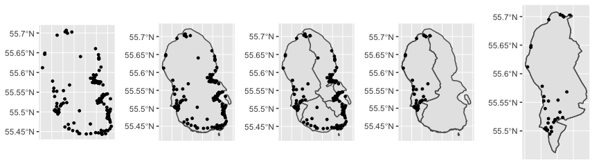
Initially I used map cordinates given by Ordinance Survey to find the centre of any KA27 postcode on a map. (KA27 being the prefix or ‘postcode area’ that denotes all Aran Island postcodes).
I then read the coordinates into sf with st_as_sf(), and plotted over a shape file map of Arran; over the SIMD data zones, as well as the section of coordinates contained in one data zone/
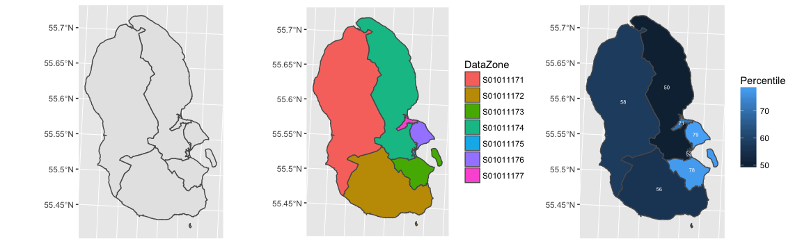
With the postcodes sorted, I then wanted to relate some other information about these areas. I used SIMD ‘DataZone boundraries’ and plotted their ERSI Shapefiles using ‘geom_sf.’ First the data zones onto the island. Then I coloured/labelled the individual data zones. Having worked that out, I wanted to show some health data about the zones. I overlayed ‘percentile’ data about the areas for 2016.
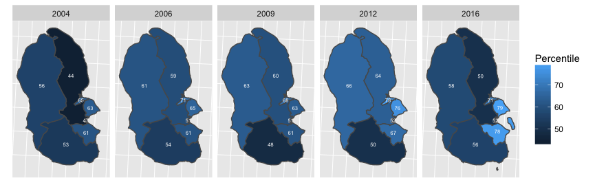
Then after faffing about with individual shape files for every year, (The data zone labels changed after 2012), I did the same for all the SIMD data periods and used facet_wrap to plot them all together.
Combining the postcode and SIMD data, I’ve summarised each of the zones below.
See these plots in a new window.
As shown at the top, I’ve since overlaid this data onto interactive maps using leaflet.
SIMD Datazones and Example Markers
The overall aim of this project is to eventually create an easy template by which a user with no prior programming knowledge can create interactive graphs or static maps by overlaying some form of data assigned to a postcode alone.
The reason I’ve chosen postcode is that it’s a prevalent measurement that can be integrated easily. Since I’ve already imported a list of Arran Postcodes with coordinates, I can create markers for any given address using one. For example, I had a list of each GP clinic on Arran. If I put this information onto an excel chart, I can subsect the original full postcode list by the clinic list, giving me a new list with coordinates I can then plot as markers on a map with labels. This means I can plot anything I’d like to see the geographical spread of and using this method is the same amount of effort plotting the data for 10 markers as it would be for 100.
I can then overlay onto the map+markers any information I want. In my first 2 maps I’ve shown SIMD DataZones (the units Scotland is subdivided into for measurement purposes), but I could create overlays dividing up the map by closest clinic for example (in 10/15/20 mile increments), or distance to the ferry for hospital transport.
If I used OS postcode tiles I could even overlay some information (a continuous/ variable matched to a colour palate) assigned to that postcode. (Like the percentile data, but showing many smaller areas over Arran).